Evaluating Trends & Making Predictions
Help Questions
ACT Science › Evaluating Trends & Making Predictions
Based on Table 1, as the distance of the light source from the plant increases, the rate of photosynthesis:
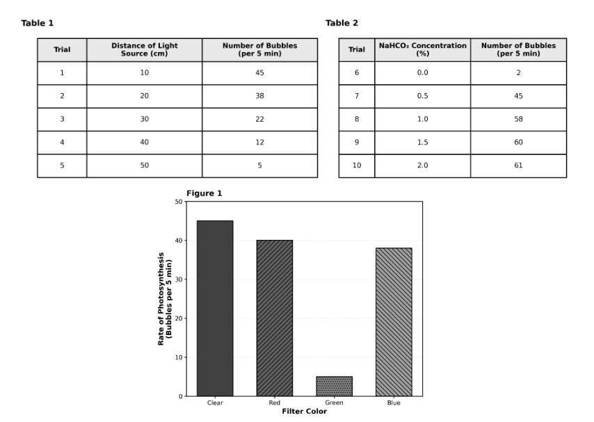
decreases, then increases.
increases linearly.
decreases only.
remains constant.
Explanation
This is a trend identification question. Table 1 shows that as distance increases from 10 cm to 50 cm, the number of bubbles decreases from 45 to 5. This is a clear, consistent downward trend with no reversals or plateaus. Choice B (decreases only) is correct. Choice A (increases) is opposite of the data. Choice C (decreases then increases) would require the trend to reverse, which doesn't happen. Choice D (constant) would require the same value at all distances. Pro tip: For trend questions, look at the overall pattern from first to last data point.
Which of the following statements best describes the relationship between depth and density within the Mantle (0-2,900 km), according to Figure 2?
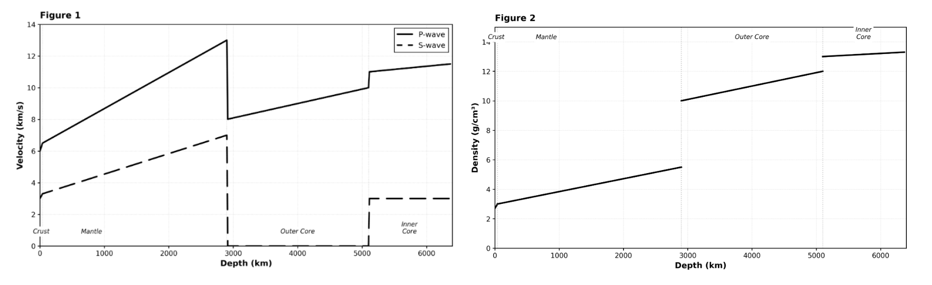
As depth increases, density remains constant.
As depth increases, density decreases linearly.
As depth increases, density increases.
As depth increases, density fluctuates randomly.
Explanation
This is a trend description question. Figure 2 shows that within the Mantle region (from the surface to 2,900 km), density increases from approximately 3.0 g/cm³ to 5.5 g/cm³. This is a steady upward trend. Choice B (density increases) correctly describes this relationship. Choice A (decreases) is opposite of the actual trend. Choice C (constant) would require a flat horizontal line. Choice D (fluctuates) would require up-and-down variation not present in the data. Pro tip: For relationship questions, focus on the overall direction of change within the specified range.
Based on the results of Study 3, if the student used a block with a mass of 5.0 kg on the smooth wood surface at 30°, the force required would be closest to:
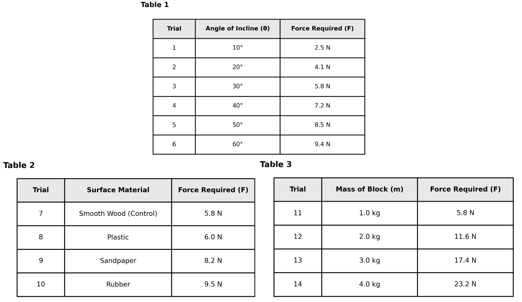
29.0 N.
25.0 N.
35.0 N.
32.0 N.
Explanation
This is an extrapolation question requiring pattern recognition. Table 3 shows a perfect linear relationship: Force = Mass × 5.8. You can verify: 1.0 kg → 5.8 N (5.8 × 1), 2.0 kg → 11.6 N (5.8 × 2), 3.0 kg → 17.4 N (5.8 × 3), 4.0 kg → 23.2 N (5.8 × 4). Continuing this pattern: 5.0 kg → 5.8 × 5 = 29.0 N. Choice B is correct. Choice A (25.0 N) doesn't follow the pattern (would be 5.0 × 5). Choice C (32.0 N) is too high. Choice D (35.0 N) is way too high. Pro tip: When data show perfect linear relationships, extend the pattern using the same mathematical rule.
According to the results of Study 1, as the angle of the incline increases, the force required to pull the block:
increases only.
remains constant.
decreases only.
increases, then decreases.
Explanation
This is a trend identification question. Table 1 shows that as the angle increases from 10° to 60°, the force increases from 2.5 N to 9.4 N. This is a consistent upward trend with no reversals or plateaus. Choice A (increases only) is correct. Choice B (decreases) is opposite. Choice C (increases then decreases) would require the trend to reverse, which doesn't happen. Choice D (constant) would show the same force at all angles. Pro tip: Check from first to last data point for the overall trend direction.
According to Figure 1, which of the three solid substances shows the least change in solubility as the temperature increases from 0°C to 100°C?
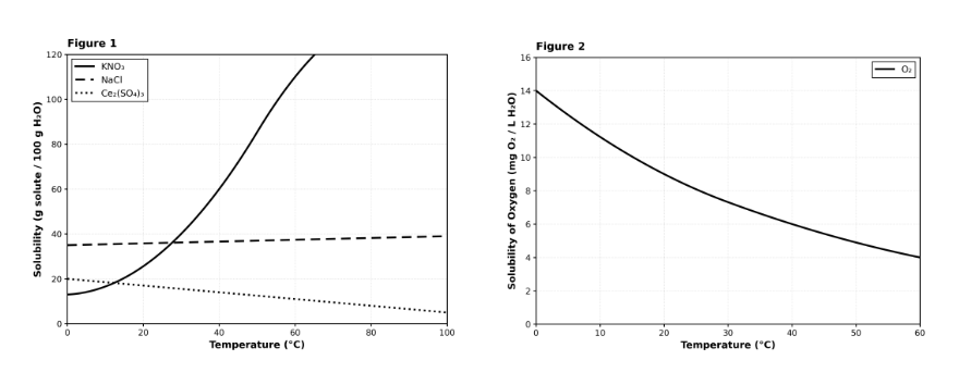
Ce₂(SO₄)₃
NaCl
KNO₃
All three substances show the same rate of change.
Explanation
This is a trend comparison question asking you to identify which curve is flattest (least change). NaCl shows almost no change in solubility across the entire temperature range—starting at 35 g at 0°C and only rising to 39 g at 100°C (a change of just 4 g). In contrast, KNO₃ changes dramatically (13 g to over 200 g), and Ce₂(SO₄)₃ also changes substantially (20 g to 5 g, a 15 g decrease). Choice B (NaCl) is correct because its curve is nearly horizontal (flat), indicating minimal change. Choice A (KNO₃) shows the MOST change with its steep upward curve. Choice C (Ce₂(SO₄)₃) shows significant change (downward). Choice D is obviously wrong—the curves have very different slopes. Pro tip: For least/greatest change questions, compare the total vertical distance each curve travels.
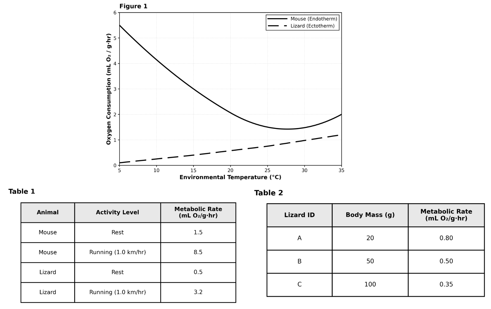
Consider the data for the Mouse at 35°C in Figure 1. If the temperature were increased further to 45°C, which of the following predictions is most biologically likely?
The metabolic rate would become identical to the Lizard's rate.
The metabolic rate would continue to decrease.
The metabolic rate would increase as the mouse pants or sweats to cool down.
The metabolic rate would drop to 0.
Explanation
This is an extrapolation/prediction question requiring biological reasoning. Figure 1 shows the Mouse's metabolic rate decreases from 5°C to a minimum at 25°C, then slightly increases at 35°C (from 1.5 to 2.0). This upturn suggests the beginning of heat stress. At 45°C (well above normal), the mouse would experience severe heat stress and need to activate cooling mechanisms (panting, increased blood flow to extremities for heat dissipation). These cooling processes require energy, increasing metabolic rate. Choice C correctly predicts this biologically realistic response. Choice A (drop to 0) would mean death, not a gradual response. Choice B (continue decreasing) ignores the upturn already visible at 35°C. Choice D (identical to Lizard) is unrealistic—endotherms and ectotherms have fundamentally different metabolic strategies. Pro tip: When extrapolating trends, consider biological limits and stress responses, not just mathematical continuation.
A student monitored the number of bacteria in a culture at the end of each hour. The data suggest a consistent multiplicative pattern. If the trend continues, what would be the predicted bacteria count at Hour 5?
Caption (49 words): Counts were taken from the same culture under constant conditions. The number of bacteria increases by the same factor each hour, indicating exponential growth over the measured period. The next value can be predicted by applying the same ratio observed between consecutive hours.
240 bacteria
360 bacteria
320 bacteria
480 bacteria
Explanation
The data reveal exponential growth in the bacteria count, with the number multiplying by a consistent factor each hour. The counts are 30 bacteria at the end of Hour 1, 60 at Hour 2, 120 at Hour 3, and 240 at Hour 4, doubling each time (multiplicative factor of 2). This quantifies the pattern as exponential growth where the count multiplies by 2 every hour. To predict the count at Hour 5, multiply the Hour 4 value by 2: 240 × 2 = 480 bacteria. One might incorrectly assume additive increases, such as adding 60 each time to get 300, but the data support multiplication.
A student measured the brightness of a lamp at different distances. If the trend shown continues, what brightness would most likely be recorded at 50 cm?
Caption (64 words): Brightness was measured in arbitrary units with the same sensor while moving it away from the lamp in 10 cm steps. The values decrease by a constant amount for each 10 cm increase in distance in this dataset. Although real light often follows a different physical law, this question asks you to extend the pattern shown by the measurements.
45 units
30 units
40 units
35 units
Explanation
The data reveal a linear decrease in lamp brightness with increasing distance. The brightness values are 55 units at 10 cm, 50 at 20 cm, 45 at 30 cm, and 40 at 40 cm, decreasing by 5 units per 10 cm increase. This quantifies the pattern as a constant decrement of 5 units for each 10 cm step, despite real light typically following inverse square law. To predict at 50 cm, subtract 5 from the 40 cm value: 40 - 5 = 35 units. A distractor could apply inverse square incorrectly to get 25 units, but extend the shown linear pattern.
A materials scientist measured the thickness of a coating after each pass of a sprayer. Based on the pattern in the table, what thickness would most likely be measured after 6 passes?
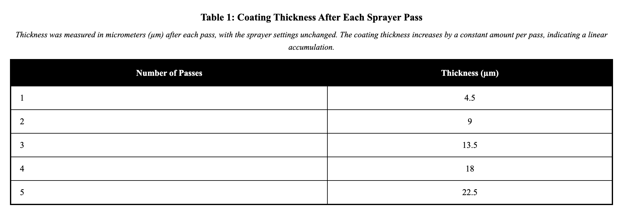
24 µm
21 µm
30 µm
27 µm
Explanation
The data show a linear accumulation in coating thickness with each sprayer pass. The thicknesses are 4.5 µm after 1 pass, 9 µm after 2, 13.5 µm after 3, 18 µm after 4, and 22.5 µm after 5, increasing by 4.5 µm per pass. This quantifies the pattern as a constant addition of 4.5 µm each pass. To predict the thickness after 6 passes, add 4.5 µm to the 5-pass value: 22.5 + 4.5 = 27 µm. Some might assume doubling instead, leading to 45 µm, but the data confirm additive growth.
An engineer recorded the distance a test cart traveled after different numbers of identical pushes on a smooth track. Based on the pattern in the table, what distance would most likely be traveled after 6 pushes?
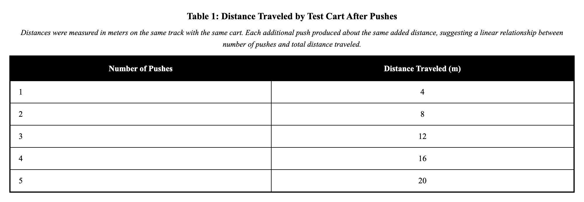
21 m
18 m
28 m
24 m
Explanation
The data indicate a linear increase in the distance traveled by the cart with each additional push. The distances are 4 m after 1 push, 8 m after 2 pushes, 12 m after 3, 16 m after 4, and 20 m after 5, with a consistent addition of 4 m per push. This quantifies the pattern as a linear relationship where each push adds 4 m to the total distance. To predict the distance after 6 pushes, add 4 m to the 5-push distance: 20 + 4 = 24 m. One might mistakenly assume a multiplicative pattern, such as doubling, which would incorrectly predict 40 m, but the data show additive increases.