How to interpret dotplots - AP Statistics
Card 0 of 12
Based on the scatter plot below, is there a correlation between the  and
and  variables? If so, describe the correlation.
Based on the scatter plot below, is there a correlation between the
Tap to see back →
The data points follow an overall linear trend, as opposed to being randomly distributed. Though there are a few outliers, there is a general relationship between the two variables.
A line could accurately predict the trend of the data points, suggesting there is a linear correlation. Since the y-values decrease as the x-values increase, the correlation must be negative. We can see that a line connecting the upper-most and lower-most points would have a negative slope.
An exponential relationship would be curved, rather than straight.
A basketball coach wants to determine if a player's height can be used to predict the number of points that player scores in a season. Before using a statistical test to determine the precise relationship of the variables, the coach wants a visual of the data to see if there is likely to be a relationship. Which of the following should the coach create?
A basketball coach wants to determine if a player's height can be used to predict the number of points that player scores in a season. Before using a statistical test to determine the precise relationship of the variables, the coach wants a visual of the data to see if there is likely to be a relationship. Which of the following should the coach create?
Tap to see back →
A scatterplot is a diagram that shows the values of two variables and provides a general illustration of the relationship between them.
A scatterplot is a diagram that shows the values of two variables and provides a general illustration of the relationship between them.
Order the correlation coefficients to fit the order of the following graphs (two coefficients will not be used)
 ,
,  ,
,  ,
,  ,
,  ,
, 
Order the correlation coefficients to fit the order of the following graphs (two coefficients will not be used)
Tap to see back →
The first graph is random scatter, no correlation, the second is perfect linear, corellation  , the last two have fairly strong positive and negative corellations, the student should know that a corellation of
  is much weaker than them
The first graph is random scatter, no correlation, the second is perfect linear, corellation
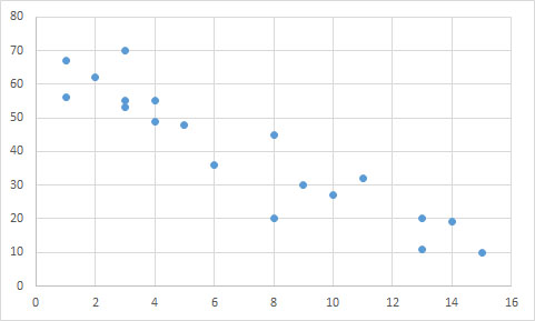
Based on the scatter plot below, is there a correlation between the and variables? If so, describe the correlation.
Based on the scatter plot below, is there a correlation between the
Tap to see back →
The data points follow an overall linear trend, as opposed to being randomly distributed. Though there are a few outliers, there is a general relationship between the two variables.
A line could accurately predict the trend of the data points, suggesting there is a linear correlation. Since the y-values decrease as the x-values increase, the correlation must be negative. We can see that a line connecting the upper-most and lower-most points would have a negative slope.
An exponential relationship would be curved, rather than straight.
The data points follow an overall linear trend, as opposed to being randomly distributed. Though there are a few outliers, there is a general relationship between the two variables.
A line could accurately predict the trend of the data points, suggesting there is a linear correlation. Since the y-values decrease as the x-values increase, the correlation must be negative. We can see that a line connecting the upper-most and lower-most points would have a negative slope.
An exponential relationship would be curved, rather than straight.
A basketball coach wants to determine if a player's height can be used to predict the number of points that player scores in a season. Before using a statistical test to determine the precise relationship of the variables, the coach wants a visual of the data to see if there is likely to be a relationship. Which of the following should the coach create?
A basketball coach wants to determine if a player's height can be used to predict the number of points that player scores in a season. Before using a statistical test to determine the precise relationship of the variables, the coach wants a visual of the data to see if there is likely to be a relationship. Which of the following should the coach create?
Tap to see back →
A scatterplot is a diagram that shows the values of two variables and provides a general illustration of the relationship between them.
A scatterplot is a diagram that shows the values of two variables and provides a general illustration of the relationship between them.
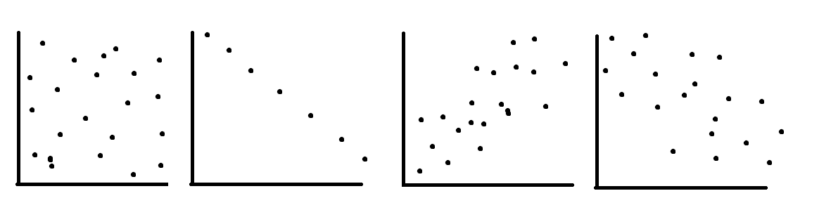
Order the correlation coefficients to fit the order of the following graphs (two coefficients will not be used)
, , , , ,
Order the correlation coefficients to fit the order of the following graphs (two coefficients will not be used)
Tap to see back →
The first graph is random scatter, no correlation, the second is perfect linear, corellation , the last two have fairly strong positive and negative corellations, the student should know that a corellation of is much weaker than them
The first graph is random scatter, no correlation, the second is perfect linear, corellation
Based on the scatter plot below, is there a correlation between the and variables? If so, describe the correlation.
Based on the scatter plot below, is there a correlation between the
Tap to see back →
The data points follow an overall linear trend, as opposed to being randomly distributed. Though there are a few outliers, there is a general relationship between the two variables.
A line could accurately predict the trend of the data points, suggesting there is a linear correlation. Since the y-values decrease as the x-values increase, the correlation must be negative. We can see that a line connecting the upper-most and lower-most points would have a negative slope.
An exponential relationship would be curved, rather than straight.
The data points follow an overall linear trend, as opposed to being randomly distributed. Though there are a few outliers, there is a general relationship between the two variables.
A line could accurately predict the trend of the data points, suggesting there is a linear correlation. Since the y-values decrease as the x-values increase, the correlation must be negative. We can see that a line connecting the upper-most and lower-most points would have a negative slope.
An exponential relationship would be curved, rather than straight.
A basketball coach wants to determine if a player's height can be used to predict the number of points that player scores in a season. Before using a statistical test to determine the precise relationship of the variables, the coach wants a visual of the data to see if there is likely to be a relationship. Which of the following should the coach create?
A basketball coach wants to determine if a player's height can be used to predict the number of points that player scores in a season. Before using a statistical test to determine the precise relationship of the variables, the coach wants a visual of the data to see if there is likely to be a relationship. Which of the following should the coach create?
Tap to see back →
A scatterplot is a diagram that shows the values of two variables and provides a general illustration of the relationship between them.
A scatterplot is a diagram that shows the values of two variables and provides a general illustration of the relationship between them.
Order the correlation coefficients to fit the order of the following graphs (two coefficients will not be used)
, , , , ,
Order the correlation coefficients to fit the order of the following graphs (two coefficients will not be used)
Tap to see back →
The first graph is random scatter, no correlation, the second is perfect linear, corellation , the last two have fairly strong positive and negative corellations, the student should know that a corellation of is much weaker than them
The first graph is random scatter, no correlation, the second is perfect linear, corellation