Common Core: 8th Grade Math : Statistics & Probability
Study concepts, example questions & explanations for Common Core: 8th Grade Math


All Common Core: 8th Grade Math Resources
Example Questions
Example Question #1 : Scatter Plots
Which of the following would most likely represent an outlier on a scatterplot which relates height (in inches) to shoe size for men?
")
")
")
")
")
An outlier is defined as a point that does not fit within the general pattern of the data. Thus, we are looking for a height that is not within the normal range for an adult male, and shoe size which is outside of the range for an adult male. Typically, an adult male would be between 65 and 77 inches tall (5 feet 5 inches and 6 feet 5 inches). Typically, an adult male's shoe size would be around a 10. Thus, the outlier would have height and shoe size drastically different from these, ")
Example Question #511 : Grade 8
Which of the following represents a positive association in a scatterplot?
As 

As 

There is no pattern amongst the data.
As 

As 

As
A positive association is defined as a scatterplot on which the best fit line has a positive slope.
This pattern is identified because on the graph, looking from left to right, the vast majority of the points goes up.
This can also be described by saying, "as 

Example Question #511 : Grade 8
A scatterplot correlates adult males' height vs. shoe size. What does the point ")
That 72 inches and 13 shoe size are outliers compared to the rest of the adult male population.
One adult male who is 72 inches tall and with a shoe size of 13.
All adult males that were surveyed were the same height and weight.
The median adult male height and shoe size.
The mean adult male height and shoe size.
One adult male who is 72 inches tall and with a shoe size of 13.
When creating a scatterplot, data is collected. This data is formulated into ordered pairs. Each of these ordered pairs, which are later graphed, represent one person's data. Thus, this particular piece of data would represent one man's height of 

Example Question #4 : Construct And Interpret Scatter Plots: Ccss.Math.Content.8.Sp.A.1
What type of correlation does this data have?
Negative correlation
Positive correlation
No correlation
Linear correlation
Positive correlation
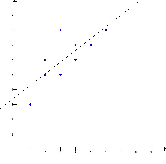
It has a positive correlation because the points all trend upward. In other words, as the independent variable on the x-axis increases, the dependent variable on the y-axis also increases. Therefore, the line of best fit that is drawn through the data represents a positive line as it has a positive slope. This verifies that our data has a positive correlation.
Example Question #1 : Construct And Interpret Scatter Plots: Ccss.Math.Content.8.Sp.A.1
This scatter plot represents data about snack quality (

I. The price of a higher quality snack tends to be higher.
II. Points below the line represent snacks whose price is higher than their quality.
III. Points above the line represent snacks whose quality is higher than their price.
I and II
II only
I and III
I only
I only
I. is a true statement about the scatter plot: as quality increases, price tends to increase.
II. is not true - the points under the line have a relatively low price compared to their quality.
III. is also not true - the points above the line have relatively low quality compared to their price.
Example Question #2 : Statistics & Probability
The scatter plot provided displays a group of students' test scores versus the length of time the students spent studying for a test. Based on plot, are there any outliers in the data?

No
Yes, point
")
Yes, point
")
Yes, point
")
No
To answer this question correctly, we need to recall what "outlier" means. An outlier is a value that is much smaller or larger than the rest of the values in a set of data. Also, a data point that does follow the same pattern as the rest of the set could be described as an outlier. In this case, if we had a student that studied 

Example Question #2 : Statistics & Probability
The scatter plot provided displays a group of students' test scores versus the length of time the students spent studying for a test. Based on plot, which of the following patterns does the relationship between number of hours spent studying and the corresponding test score represent?
A negative association, a lower number of hour spent studying correlated to a higher test score
The results shown do not show any sort of pattern
A positive association, a higher number of hours spent studying correlated to a higher test score
A positive association, a higher number of hours spent studying correlated to a lower test score
A positive association, a higher number of hours spent studying correlated to a higher test score
In the provided scatter plot, we can pick out data points and organize them from least to greatest, based on hours spent studying:

Based on the results, we can see that as the number of hours spent studying increased, the test grade also increased; thus, a positive association, a higher number of hours spent studying correlated to a higher test score.
Example Question #3 : Statistics & Probability
The scatter plot provided displays a group of students' test scores versus the number of missing assignments the students have. Based on plot, are there any outliers in the data?

Yes, point
")
Yes, point
")
No
Yes, point
")
No
To answer this question correctly, we need to recall what "outlier" means. An outlier is a value that is much smaller or larger than the rest of the values in a set of data. Also, a data point that does follow the same pattern as the rest of the set could be described as an outlier. In this case, if we had a student that had 

Example Question #4 : Statistics & Probability
The scatter plot provided displays a group of students' test scores versus the length of time the students spent studying for a test. Based on plot, select the answer choice with the data point that if added to the graph, would be an outlier.
")
")
")
")
To answer this question correctly, we need to recall what "outlier" means. An outlier is a value that is much smaller or larger than the rest of the values in a set of data. Also, a data point that does not follow the same pattern as the rest of the set could be described as an outlier.
Let's look at our answer choices:
")
This point is showing that a student who studied for 


")
")
This point is showing that a student who studied for 


")
")
This point is showing that a student who studied for 


")
")
This point is showing that a student who studied for 


")
Example Question #1 : Statistics & Probability
The scatter plot provided displays a group of students' test scores versus the number of missing assignments the students have. Based on plot, select the answer choice with the data point that if added to the graph, would be an outlier.
")
")
")
")
To answer this question correctly, we need to recall what "outlier" means. An outlier is a value that is much smaller or larger than the rest of the values in a set of data. Also, a data point that does not follow the same pattern as the rest of the set could be described as an outlier.
Let's look at our answer choices:
")
This point is showing that a student had 


")
")
This point is showing that a student who had 


")
")
This point is showing that a student who had 


")
")
This point is showing that a student who had 


")


All Common Core: 8th Grade Math Resources

